Artwork Requirements for Plastic Card Printing: Full Checklist
Table of Contents []
- Artwork Requirements for Plastic Card Printing - Plastic Card ID
- Card Dimensions and File Setup Fundamentals
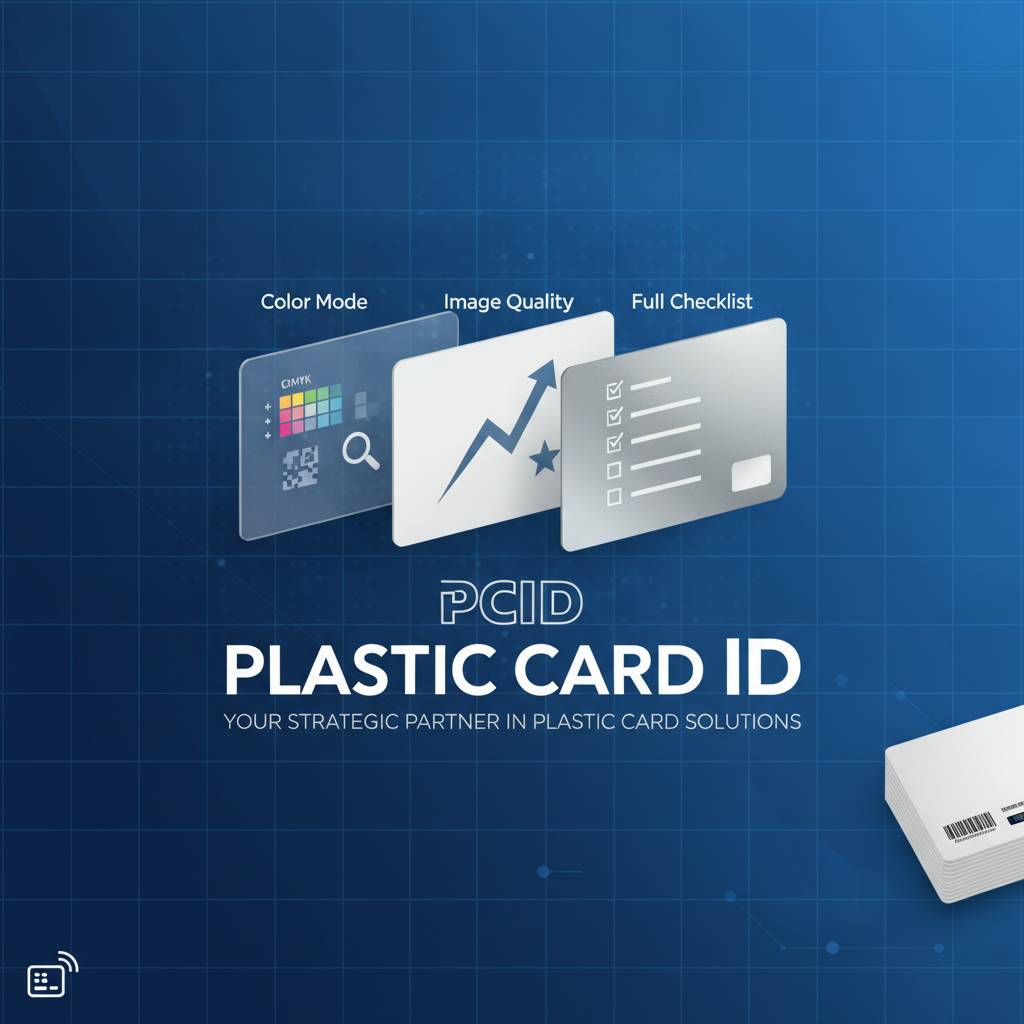
- Color Mode, Resolution, and Image Quality
- File Formats and Submission Best Practices
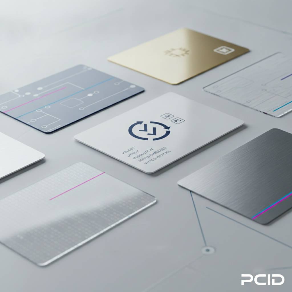
- Design Elements That Affect Print Quality
- Common Artwork Mistakes and How to Avoid Them
- Working with Plastic Card ID on Your Card Artwork
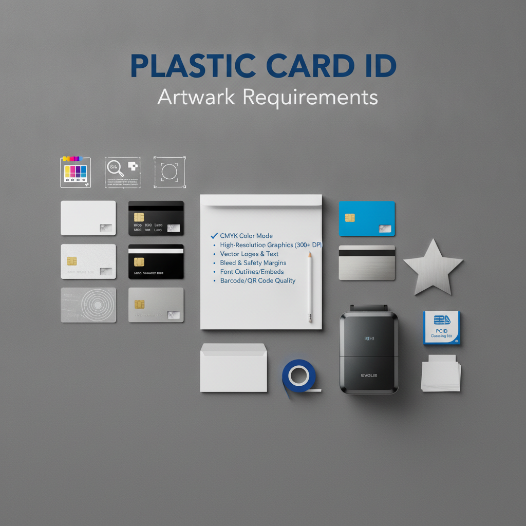
Artwork Requirements for Plastic Card Printing - Plastic Card ID
 Getting your card design wrong is an expensive lesson. Send a file that is too low-resolution, built in the wrong color mode, or missing bleed, and the cards that come back will not look like what you imagined. They will look like a mistake - and they will represent your brand every single day. Understanding the artwork requirements for plastic card printing before you submit a file is the single most effective way to protect your investment and get cards that genuinely impress.
At Plastic Card ID, we have processed artwork from tens of thousands of customers over more than two decades. We have seen it all - gorgeous, press-ready files that print perfectly on the first pass, and well-intentioned designs that needed significant rework before they could be run. This page exists so your file lands in the first category, not the second. Whether you are printing 50 loyalty cards for a neighborhood coffee shop or 50,000 membership cards for a national organization, the file standards are the same.
| Specification | Required Standard | Common Mistake |
|---|---|---|
| Card Size (CR80) | 3.375" x 2.125" | Using business card dimensions |
| Resolution | 300 DPI minimum | Submitting 72 DPI screen exports |
| Color Mode | CMYK | Designing in RGB and not converting |
| Bleed | 1/8" (0.125") on all sides | No bleed; white edges after cutting |
| Safe Zone | 1/8" inset from trim line | Text touching the edge |
| Preferred File Formats | PDF, AI, EPS, high-res TIFF | JPEG, PNG, Word documents |
| Fonts | Embedded or outlined | Live text with missing font files |
Card Dimensions and File Setup Fundamentals
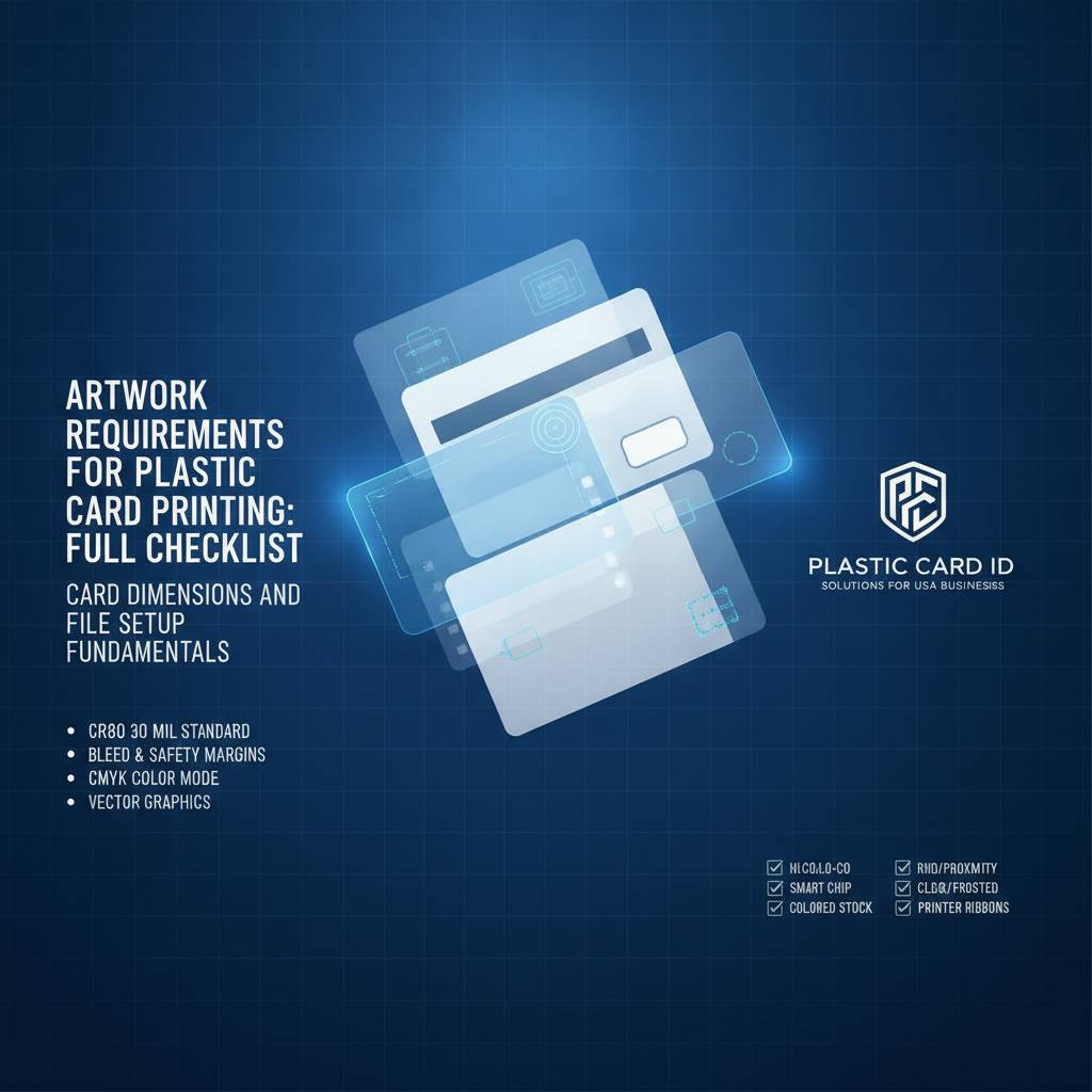 The standard plastic card - the CR80 format governed by ISO 7810 - measures exactly 3.375 inches wide by 2.125 inches tall at 30 mil thickness. That is the same size as a driver's license or a major credit card. Every design file you build should be set up at exactly these dimensions from the very first moment you open your design application. Trying to retrofit an incorrectly-sized file causes distortion, scaling errors, and misaligned elements that only become obvious after printing.
Beyond the trim dimensions, your document must include bleed. Bleed is the zone outside the finished card edge where background colors and images extend - typically 0.125 inches on every side. Without it, the slight natural variation in the cutting process leaves a thin white border on one or more edges. It is a small detail with a big visual impact, and it is entirely preventable when the file is set up correctly from the start.
Setting Up Your Document Correctly
Open your design application and create a new document sized at 3.625 inches by 2.375 inches - that is the card dimensions plus bleed on all four sides. Establish guides at the actual trim edges (0.125 inches in from each side) and a second set of guides at the safe zone boundary, another 0.125 inches further inward. Any critical content - logos, names, important text - must live inside that inner safe zone boundary.
Working at the correct size from the beginning means every element you place is proportionally accurate. Scaling a finished design up or down to fit a card introduces compression artifacts, rasterizes vector elements, and shifts proportional relationships in ways that are sometimes subtle and always unprofessional. Start right; finish right.
Understanding Bleed, Trim, and Safe Zones
Think of it in three concentric rectangles. The outermost rectangle is the bleed boundary - your artwork must reach this edge. The middle rectangle is the trim line, where the card will actually be cut. The innermost rectangle is the safe zone - the area where everything critical must remain. Any element that crosses from the safe zone toward the trim line risks being clipped.
Background colors and images should flood the entire bleed area. Decorative elements near the edges should be intentionally positioned to straddle the trim gracefully. Logos and text belong well inside the safe zone. This layered spatial logic is universal across all print production, and plastic card printing is no exception.
Magnetic Stripe and Chip Placement Considerations
If your cards include a magnetic stripe or a smart chip, those physical features occupy specific zones on the card face and back. The magnetic stripe runs horizontally across the back of the card, typically occupying a 0.375-inch-tall band in the upper portion of the card back. Your artwork must account for this area - it cannot be covered by critical design elements that compete visually with the stripe.
Smart chip cards have a contact pad on the front of the card, generally positioned in the lower-left area. Plan your design layout with these constraints in mind from the beginning. Trying to rearrange a finished design around a chip or stripe you forgot is far more work than building around it from the outset. Plastic Card ID can provide exact positioning templates when you place your order.
Color Mode, Resolution, and Image Quality
Two file problems account for the majority of print quality disappointments: wrong color mode and insufficient resolution. They are completely avoidable, and fixing them after the fact is straightforward when you know what to look for. The goal is that what prints on plastic looks as close as possible to what you designed on screen - and that requires understanding how digital color and physical ink relate to each other.
Color translation from screen to print is not automatic. Your monitor displays color using light (RGB - red, green, blue), while printing applies ink (CMYK - cyan, magenta, yellow, black). These are fundamentally different systems with different gamuts, and some colors that look vivid on screen simply cannot be reproduced exactly in print. Designing in CMYK eliminates the guesswork and ensures that your color choices are print-achievable from the moment you make them.
Why CMYK Is Non-Negotiable
RGB files that are submitted for print must be converted to CMYK before production. That conversion changes colors - sometimes significantly. Bright blues, electric greens, and neon oranges are particularly prone to shifting toward dull, muddy versions of themselves. When you design in CMYK from the start, you are choosing from the actual palette that ink can reproduce, which means no surprises when the physical cards arrive.
Specific brand colors should be mapped to their closest CMYK equivalents. If your brand uses Pantone colors, ask CPE for guidance on converting to CMYK values - it is a simple lookup that preserves brand consistency across all your printed materials. Consistency between your digital brand assets and your physical cards matters. It signals professionalism.
Resolution Standards for Sharp, Clean Output
Resolution for print is measured in dots per inch (DPI). The minimum acceptable resolution for plastic card printing is 300 DPI at the final print size. Images sourced from websites are typically 72 DPI - screen-resolution images that look fine on a monitor but print blurry, pixelated, and amateurish on a physical card. There is no software fix that genuinely restores resolution to a low-DPI image.
When sourcing photographs or raster images for your card design, obtain the highest resolution version available. Stock photography services provide high-resolution downloads specifically for print use. If you are working with a logo provided by a client or marketing team, request the original vector file (AI or EPS) rather than a JPEG screenshot. Vector artwork is infinitely scalable with zero quality loss - it is always the right choice for logos and type-based elements.
Raster vs. Vector Elements in Your Design
Understanding the distinction between raster and vector artwork helps you make smart decisions throughout the design process. Raster images are built from a fixed grid of pixels - they have a defined resolution that cannot be increased without quality loss. Photographs are always raster. Vector artwork uses mathematical paths that scale to any size with perfect clarity - logos, icons, and typographic treatments are ideally built as vectors.
A card design that uses vector elements for all its structured graphic components and only uses high-resolution raster images for photographs will always print cleanly. Mixing low-resolution raster elements with crisp vector elements creates jarring inconsistency. Audit every element in your file before submission. Ask: is this image at 300 DPI or better? If the answer is no, replace it with a higher-resolution version before sending.
File Formats and Submission Best Practices
 The file format you submit tells a story about your preparation. PDF remains the gold standard for print-ready art submission because it preserves all design elements, embeds fonts, maintains color settings, and packages everything into a single portable file. AI and EPS formats from Adobe Illustrator are equally excellent for vector-based designs. High-resolution layered TIFF files are acceptable for raster-focused designs. These formats protect your work in transit from your computer to production.
Formats to avoid: standard JPEG, PNG, GIF, BMP, or documents created in Microsoft Word, Publisher, or PowerPoint. These formats introduce compression, limit color precision, and often lack the resolution needed for clean output at card size. A JPEG might look fine on your screen but will frequently disappoint in print because of compression artifacts and fixed low resolution. When in doubt, export as a press-quality PDF and you will rarely go wrong.
Exporting a Press-Ready PDF
Most professional design applications - Adobe Illustrator, InDesign, Affinity Publisher - include a PDF export preset labeled "PDF/X-1a" or "Press Quality." These presets automatically handle the critical settings: color conversion to CMYK, font embedding, crop marks, and bleed inclusion. Use them. They exist precisely because press-ready PDF creation has a defined, repeatable standard that eliminates ambiguity between designer and printer.
When exporting, confirm that your bleed settings are reflected in the export dialog. Some applications require you to explicitly specify bleed values at export even if they were set up in the document. Enable crop marks and color bars if your export dialog offers them - they give the production team visual confirmation that your file includes proper bleed and trim references. A few extra seconds at export save hours of back-and-forth correction.
Fonts: Embed or Outline Before Submitting
Fonts are software, and font files do not automatically travel with your design files. When you send a file with live (unoutlined) text to a printer, the production system must have the exact same font installed to display and print that text correctly. If it does not - and it often does not - the text will either substitute a default font or display as gibberish. The solution is simple: outline all fonts before saving your final file.
Outlining converts text characters into vector shapes, permanently embedding their appearance in the file without depending on font software. In Adobe Illustrator, select all text, then use the Type menu to create outlines. In InDesign, this happens automatically at PDF export when using press presets. Once fonts are outlined, the text can no longer be edited - so always keep an editable backup of your original working file. Never send your only copy with outlines.
- Export as PDF/X-1a or PDF Press Quality - it handles most settings automatically
- Outline all fonts before final file save, and keep an editable backup
- Embed all linked images - do not send a file that relies on externally linked assets
- Confirm CMYK color mode before export, not after
- Include 0.125 inch bleed on all four sides in your export settings
- Enable crop marks and registration marks in your PDF export dialog
- Name your file clearly - client name, card type, version number - for easy tracking
Proofing Your File Before Submission
Print a proof at home or at an office printer before submitting - even if your office printer is not calibrated for card printing, a physical printout at card dimensions reveals spatial problems, crowded text, and layout issues that you simply cannot see reliably on a monitor. Cut out the printed card at size and hold it. Does it read well? Is anything clipped at the edges? Does it look like a professional card you would be proud to hand someone?
Also open your exported PDF in a standalone PDF reader (not the design application that created it) and verify that all fonts display correctly, all images appear sharp, and the bleed area is visible. A thirty-second review of the final file in a neutral viewer catches the font-substitution and missing-image errors that would otherwise only surface during production - when fixing them costs time and potentially restarts your order timeline.
Design Elements That Affect Print Quality
 Beyond file format and resolution, individual design choices have a direct effect on how well a card prints. Thin lines, small text, fine details, and reversed-out type all present specific challenges in print production that experienced designers plan for deliberately. These are not reasons to avoid these elements - they are reasons to use them with informed precision.
Cards are small. The entire canvas is just 3.375 by 2.125 inches. Design elements that look balanced at large scale on a screen can feel cramped, illegible, or visually noisy at actual card size. Zoom your design to 100 percent actual size on screen - or better, print at scale - and evaluate it fresh. The card should communicate its key information instantly, at a glance, as it will be handled quickly in real-world use.
Minimum Text Size and Legibility
Text below 6 points becomes difficult to read reliably on a printed plastic card. Type at 4 points or smaller may print technically but will require a magnifying glass to decipher - which defeats the purpose entirely. Important information like names, numbers, expiration dates, and website URLs should be set at 8 points or larger for comfortable reading. Fine print that truly needs to appear small should be no smaller than 5-6 points, and using a clean, simple sans-serif typeface helps at small sizes.
Reversed-out text - light text on a dark background - requires slightly heavier font weights than dark-on-light text at the same size. Thin, delicate typefaces can fill in and lose legibility when reversed. If your design calls for reversed text, choose a medium or semibold weight rather than a thin or light variant, particularly at smaller sizes. Test it in your proof print before finalizing.
Fine Lines, Gradients, and Photographic Elements
Lines thinner than 0.25 points (approximately 0.088mm) may not reproduce reliably in card printing. They can appear broken, inconsistent, or disappear entirely depending on the production process and card substrate. If you are incorporating hairline rules or fine decorative borders, bump their weight to at least 0.5 points for consistent reproduction. This is especially important for elements that frame the card edge or define visual structure.
Gradients generally print beautifully on plastic cards, but very subtle gradients - those that transition over a small tonal range - can produce visible banding on certain substrates. If your design includes a fine tonal gradient as a background, add a slight amount of noise or texture to the gradient in your design application to break up potential banding. It is a simple technique that significantly improves the appearance of smooth tonal transitions.
Special Finishes and Their Artwork Implications
If your card order includes specialty finishes - such as matte laminate, gloss overlay, or signature panel - these physical features interact with your artwork placement. A signature panel on the reverse, for example, must be left as a blank area in your artwork because the panel itself is a physical adhesive element applied during production. Printing over that zone creates adhesion problems and visual inconsistency.
Clear and frosted plastic cards present a unique design challenge: the card substrate itself is part of the visual design. Areas of transparent card can be intentional design features - letting through wallet color, showing a layered effect, or creating an ultra-modern look. However, you must plan which areas of your artwork are printed and which are left clear, and your file must clearly communicate this to the production team. CPE can walk you through the file requirements for specialty card types when you discuss your order.
Common Artwork Mistakes and How to Avoid Them
After processing millions of card orders, certain artwork errors appear with striking regularity. They are not the result of bad design skill - they are the result of not knowing what the production process requires. Knowing the most common mistakes before you build your file is the clearest path to getting it right the first time. Here is what the Plastic Card ID production team sees most often, and how to sidestep each issue cleanly.
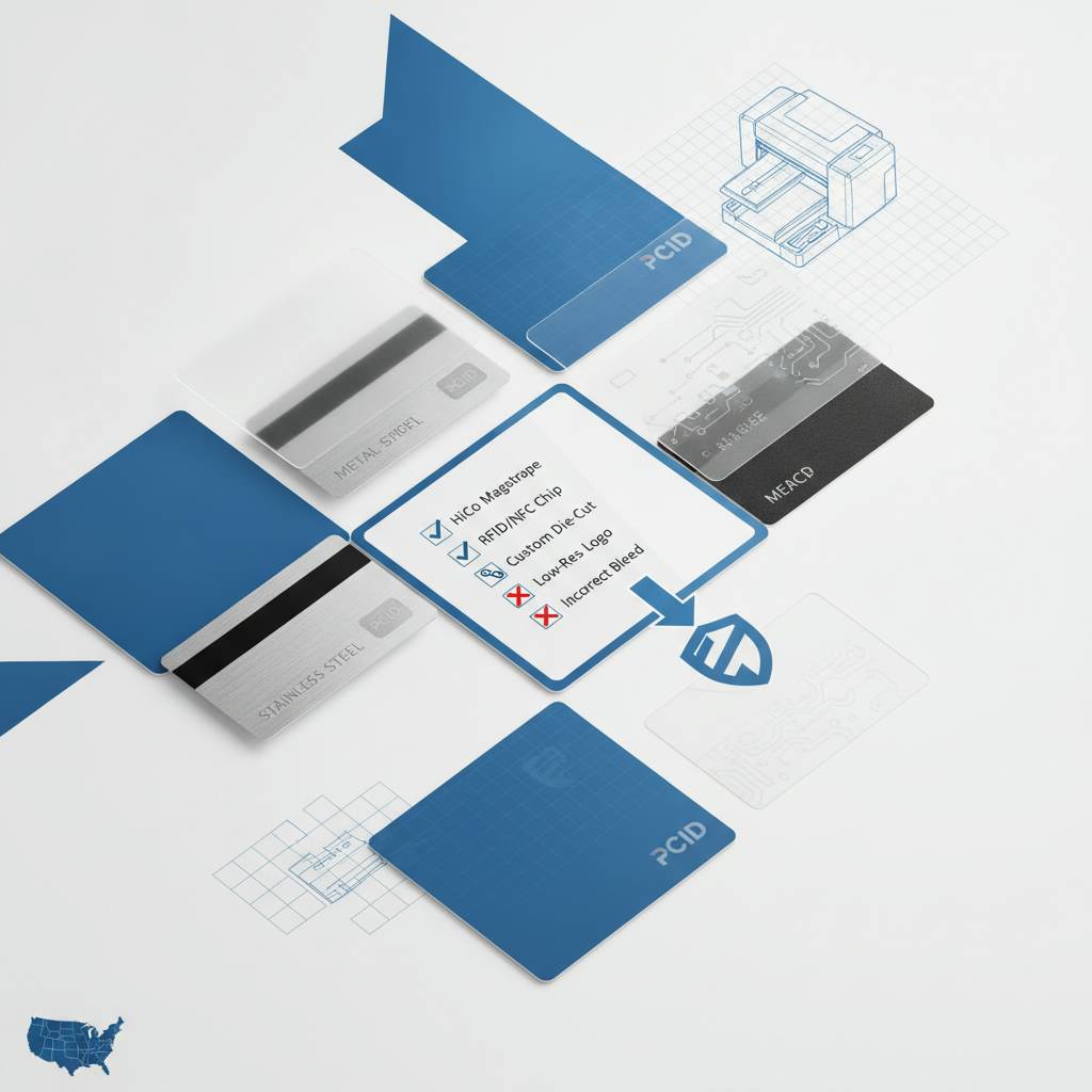
The most costly mistakes are not technical - they are conceptual. Designers who approach plastic card artwork as though it were a web graphic or a social media asset run into trouble because the output medium has different requirements. Plastic card printing is a physical production process with tight tolerances, specific color behavior, and real-world usability demands. The awareness of those differences is what separates files that print beautifully from files that need revision rounds.
Top Artwork Problems We See Regularly
- RGB files submitted without CMYK conversion - colors shift unpredictably and are sometimes dramatically different from screen appearance
- Low-resolution logos pulled from a website - logos appear blurry or pixelated on the finished card; always request original vector files
- No bleed included - cards arrive with thin white edges on one or more sides, requiring a reprint
- Critical text or logos placed too close to the card edge - slight cutting variation clips the element, making the card look unfinished
- Live fonts not outlined, with no font files provided - text substitutes to a default font at production, changing the entire look
- Magnetic stripe or chip area not accounted for - design elements clash with or are hidden behind functional card features
- Submitted as a Microsoft Word or PowerPoint file - these formats are not suitable for professional print production under any circumstances
Each of these errors adds time to your order - time spent in revision, resubmission, and sometimes reprinting. None of them are difficult to avoid when you know what to watch for. This is why Plastic Card ID provides pre-press review support: a second set of professional eyes on your file before it runs is one of the most valuable things we offer.
When to Use a Design Template
If you are new to print design or are building card artwork in-house for the first time, starting from a professionally prepared template is a smart move. Templates arrive pre-configured with correct dimensions, bleed, safe zone guides, color mode, and resolution settings. All you need to do is replace placeholder elements with your actual artwork, logo, and text. The foundational structure is already correct.
Plastic Card ID offers artwork templates for standard CR80 cards, cards with magnetic stripes, and several other common configurations. Ask for them when you contact us. Starting from a template does not limit your creativity - it simply means you spend your design time on the visual elements rather than on technical file setup. It is an efficient, reliable way to get your first card program off the ground quickly. Contact us at 800.835.7919 and we will send you the right template for your card type.
Revision Rounds and Turnaround Impact
Every revision round adds days to your production timeline. File issues that require resubmission - wrong color mode, missing bleed, font problems - typically add two to four business days to the process, and in high-demand periods they can add more. If your card program has a launch deadline tied to an event, a retail opening, or a membership renewal cycle, file quality is directly connected to your timeline.
The cleanest path to on-time delivery is a press-ready file on first submission. Use the quick-reference guide at the top of this page as a pre-submission checklist. Run through every line before you upload or email your file. A five-minute self-review before submission frequently saves days of back-and-forth correction after. The time investment is trivially small relative to the timeline protection it provides.
Working with Plastic Card ID on Your Card Artwork
 Twenty-five years and more than fifty million cards printed means Plastic Card ID has seen every kind of artwork challenge imaginable - and developed practical, efficient ways to work through each one. Whether you are a seasoned graphic designer who prints cards regularly or a business owner building your very first loyalty card program, CPE is here to support the artwork process, not just process the order.
Our pre-press team reviews every file before it enters production. We check for bleed, resolution, color mode, font embedding, and mechanical card feature conflicts. When we find something that would affect your final output, we contact you with a specific, clear explanation of what needs to be adjusted - not vague feedback, but precise technical guidance. That review step exists because we would rather fix a file problem before printing than have you receive cards that do not look right.
Custom Card Types and Their Specific File Requirements
Beyond the standard CR80, Plastic Card ID offers a wide range of specialty card types - each with its own artwork considerations. Clear and frosted cards require transparent-aware file design, where the designer deliberately plans which areas are printed and which remain clear. Hotel key cards and RFID proximity cards have specific chip and antenna zone restrictions that must be honored in the artwork layout. Custom die-cut cards require a die-line file provided alongside the artwork file, defining the exact shape to be cut.
Luxury metal cards in stainless steel, brass, and gold require artwork files built for laser engraving rather than ink printing - a fundamentally different approach. The contrast between engraved and non-engraved areas replaces color differentiation, so the design must be built around that visual logic. When you order any specialty card type, ask CPE for specific file requirements and templates for that product category before you begin designing.
Variable Data and Personalized Card Programs
Variable data printing - where each card in a run carries unique information like a name, number, or barcode - requires file setup beyond standard static design. The base artwork (background, logo, static text) is prepared as a fixed design layer, while the variable elements are delivered as a separate data file, typically a properly formatted spreadsheet. The variable data is merged with the base artwork during production to produce individually unique cards at scale.
For variable data orders, confirm with CPE the exact field names, data formats, and character limits required in your spreadsheet before you build it. Variable fields must match exactly between your data file and the design template - a mismatched column header means a failed merge and a delayed order. Clear communication at the outset of a variable data project makes the whole process smooth and reliable.
Getting a Quote and Starting Your Order
Starting a card program with Plastic Card ID is straightforward. Tell us what type of card you need, what quantity, whether you need encoding (magnetic stripe, RFID, chip), and any special features. We will provide a clear, detailed quote with no hidden fees. If you have artwork ready, submit it with your order and our pre-press team will review it. If you need templates or have questions about preparing your file, we are ready to help before you start designing.
From fifty cards to fifty thousand, from simple blank PVC stock to MIFARE DESFire smart cards, Plastic Card ID has the inventory, the production capability, and the experience to deliver a card program that works the way you need it to. The artwork you prepare today becomes a card that represents your brand every time it is handed across a counter, scanned at a door, or pulled from a wallet. It is worth doing right.
Ready to submit your artwork or start your card program? Contact Plastic Card ID today at 800.835.7919 - our team is standing by to review your file, answer your artwork questions, and get your cards into production.
Plastic Card ID - Your strategic partner for plastic card programs across the United States. Call 800.835.7919 and let's build something great together.
Previous Page