Color Matching on Printed Plastic Cards: Tips for Accuracy
Table of Contents []
- Color Matching on Printed Plastic Cards: Why It Matters More Than You Think - Plastic Card ID
- Understanding Color Modes: The CMYK vs. RGB Distinction That Can Save Your Program
- Card Substrate and Surface Finish: Hidden Factors in Color Output
- Printer Calibration: The Ongoing Variable Most Organizations Ignore
- Advanced Color Techniques for High-Impact Card Programs
- Buyer's Guide: Getting Color Matching Right Before You Order
- Why Plastic Card ID Is the Right Partner for Your Card Color Program
Color Matching on Printed Plastic Cards: Why It Matters More Than You Think - Plastic Card ID
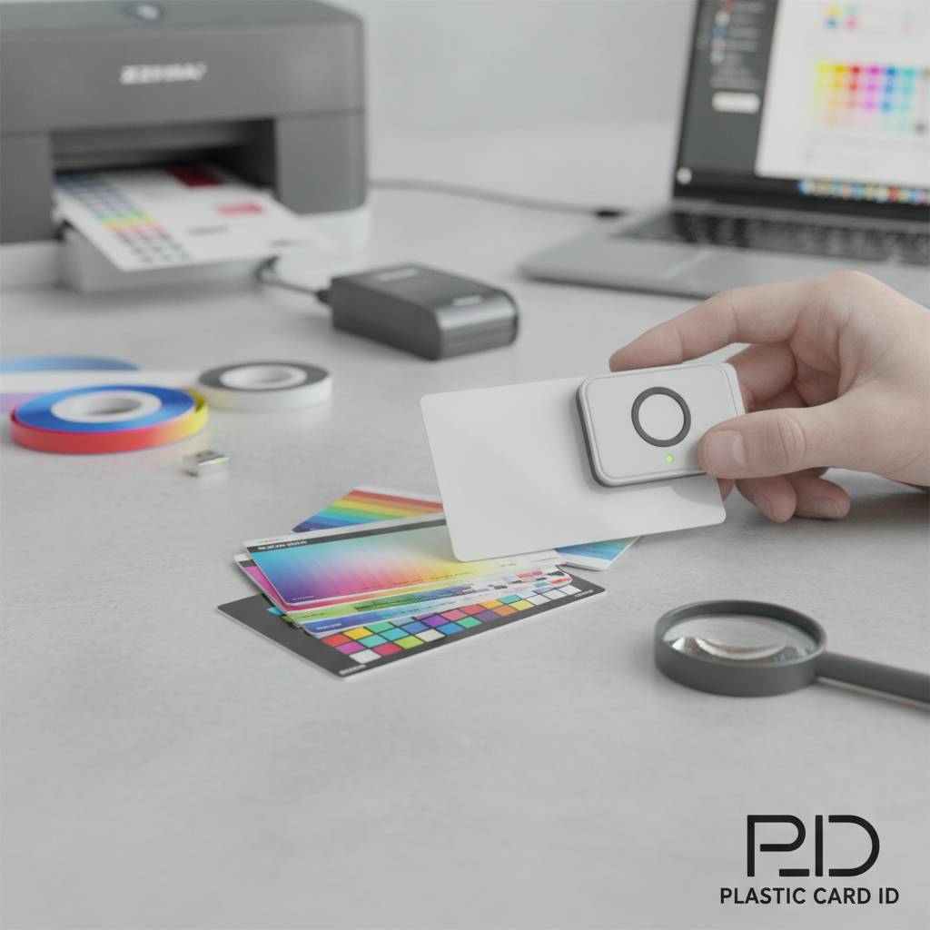 Hand someone a card and you have about three seconds. Three seconds before they decide whether it represents something worth keeping or something destined for the trash. Color is doing most of the heavy lifting in that moment - not copy, not even the logo. Color matching on printed plastic cards is one of the most consequential decisions in any card program, and yet it is routinely underestimated by organizations that are otherwise meticulous about their branding.
Whether you are issuing employee ID badges, rolling out a loyalty program, or distributing membership cards to thousands of customers, the fidelity between your brand's established color palette and what actually appears on the card surface determines how professional - and trustworthy - your organization looks at the point of contact. This page breaks down everything you need to know to get it right.
| Card Type | Print Method | Color Accuracy | Best Use Case |
|---|---|---|---|
| Blank White PVC (CR80) | Direct-to-card printer | Very High | ID badges, loyalty, membership |
| Pre-colored Stock Card | Direct-to-card printer | High (with calibration) | Events, access control |
| Clear / Frosted PVC | Direct-to-card printer | Moderate (translucency affects perception) | Premium membership, VIP |
| Custom Pre-printed Card | Offset or digital pre-print | Highest (Pantone achievable) | Gift cards, branded loyalty |
| Metal Cards (Steel/Brass/Gold) | Laser engraving / color fill | High with design-appropriate adjustments | Luxury VIP, high-value membership |
Understanding Color Modes: The CMYK vs. RGB Distinction That Can Save Your Program
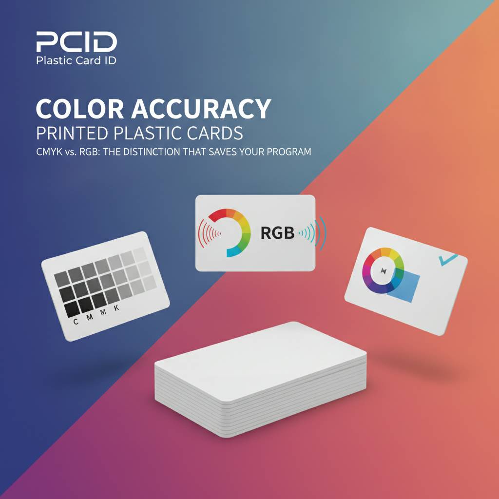 Here is where many organizations stumble before they even order a single card. Designing in RGB and expecting CMYK output is one of the most common and avoidable color-matching errors in card printing. Digital screens - monitors, phones, tablets - display color using RGB (red, green, blue) light. Card printers, like all physical print processes, work in CMYK (cyan, magenta, yellow, black). The two systems do not share identical color spaces.
What looks like a deep cobalt blue on your screen can arrive on a printed card as something noticeably more muted, sometimes approaching a steel gray in the highlights. Vibrant greens, electric purples, and certain near-neon tones are especially vulnerable to this shift. Knowing this upfront - and preparing your files accordingly - dramatically narrows the gap between what you designed and what you hold in your hand.
Why Screen Colors Lie to Designers
Monitors are backlit. They generate their own light, which means they can display a much wider color gamut than any reflective printed surface. When you stare at a brand-blue on a calibrated 4K display, you are looking at emitted light amplifying that hue. The printed card can only reflect ambient light off ink-on-plastic, which is inherently less saturated at the extremes of the spectrum.
This is not a flaw in card printing technology - it is a fundamental property of physics. The solution is to work in CMYK from the start of your design process, or to use a tool that accurately simulates print output. Professional designers know this; marketing teams often do not, which is exactly why it is worth spelling out before your cards go to production.
Pantone Spot Colors and When They Apply
Pantone matching is the gold standard for brand color consistency. If your style guide specifies Pantone 286 C for your corporate blue, a Pantone-matched print process will hit that target with near-perfect repeatability across different print runs and substrates. For in-house card printing with desktop card printers from brands like Evolis, Zebra, or Fargo, you are working with dye-sublimation or thermal transfer, not Pantone inks - but you can still convert Pantone values to their CMYK equivalents and calibrate your printer's color profile accordingly.
For higher-volume, pre-printed custom card orders, offset and digital pre-press processes can accommodate Pantone references far more precisely. If your brand has strict Pantone requirements, a pre-printed custom card is almost always the right production path. CPE can walk you through which option makes sense based on your volume, budget, and color sensitivity.
Preparing Your Artwork File Correctly
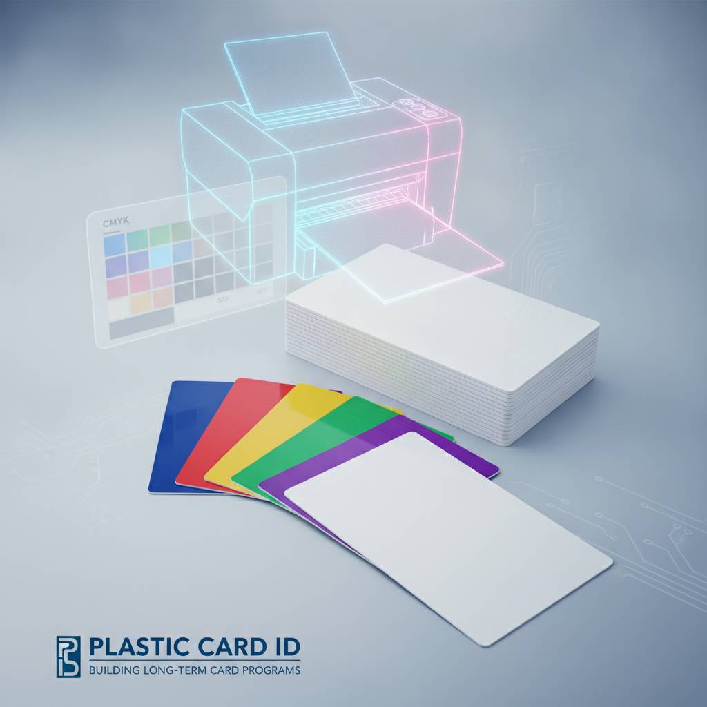
Vector files - EPS, AI, or PDF with embedded fonts and linked images - give you the cleanest color output. Rasterized images should be set to 300 DPI at full print size, which for a CR80 card means 3.375 x 2.125 inches at 300 DPI minimum. Submit files in CMYK color mode, not RGB. If your brand colors were defined in RGB, convert them and visually check the result before locking in your final file.
It is also worth supplying a color reference - either a printed Pantone swatch, a physical sample card, or specific CMYK percentage values - with your order. This gives production teams a concrete target rather than relying on file interpretation alone. Small details at this stage prevent expensive reprints and delays.
Card Substrate and Surface Finish: Hidden Factors in Color Output
Two cards printed with identical CMYK values can look strikingly different if one is printed on bright white PVC and the other on a natural-tinted or frosted substrate. The substrate is effectively the "paper" of your card program - and it profoundly affects how ink is absorbed, how light reflects, and how the final color is perceived by the human eye.
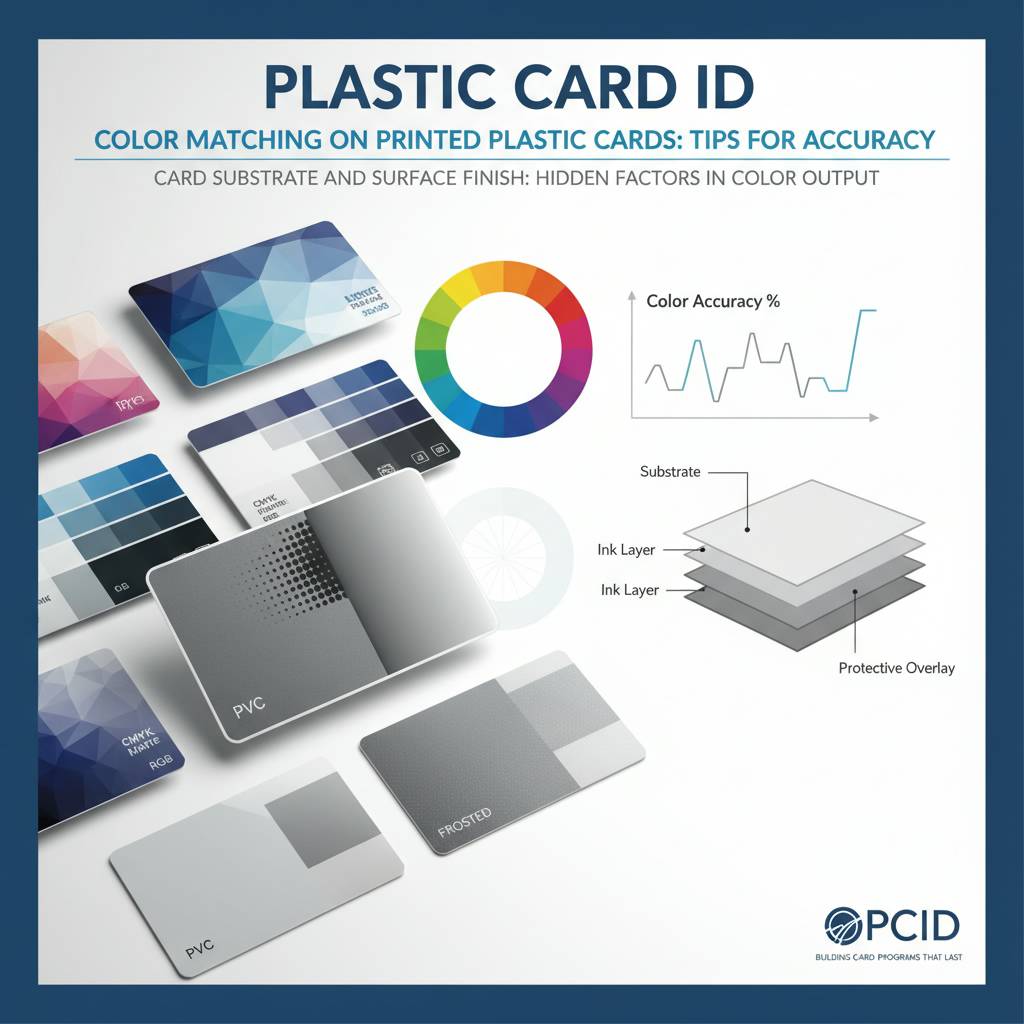
White PVC is the most forgiving and accurate base for dye-sublimation printing. Colors appear as intended because the white surface acts as a neutral backdrop. As you move into colored stock cards, clear cards, or frosted PVC, color rendering becomes a more deliberate artistic and technical decision rather than a simple print operation.
White PVC: The Benchmark Substrate
Standard CR80 white PVC cards at 30 mil thickness are the universal baseline for color accuracy in card printing. When in doubt, start here. The bright white surface reflects light evenly, and dye-sublimation dyes penetrate into the card surface rather than sitting on top, creating vivid, durable color that resists flaking and peeling. If your primary concern is brand color fidelity, white PVC with a properly calibrated dye-sub printer is your safest starting point.
There is also a practical cost argument. Blank white CR80 cards are the most affordable option per unit, meaning you can maintain larger inventories, reprint with lower risk, and iterate on card designs more freely. For programs running anywhere from 50 cards a month to several thousand, this cost efficiency compounds over time.
Clear and Frosted Cards: Beauty with Complexity
Clear and frosted PVC cards have an undeniable premium appeal - they signal something different before a word is read. But color printing on a translucent substrate introduces a layer of complexity that designers must anticipate. Colors printed on clear PVC appear differently depending on what is held behind the card - a white wall versus a dark desk surface can dramatically alter the visual perception of the same printed color.
Frosted cards diffuse light more evenly, which can soften printed colors into a muted, elegant aesthetic. This is often desirable for luxury membership programs or upscale hospitality cards. If you are targeting a specific brand color, test print on the chosen substrate before committing to a full run. CPE stocks both clear and frosted options and can help you understand realistic color expectations on each.
Colored Stock Cards: Working With the Base Tint
Pre-colored PVC stock - available in a range of hues from black to red to blue - adds visual punch without any printing at all, but printing additional design elements on top requires understanding how ink colors interact with the base card color. Printing yellow on a black card, for instance, will appear very differently than on white. Lighter ink colors lose definition. Dark colors and metallic effects tend to hold up better.
This is not a reason to avoid colored stock - it is a reason to plan your design around the substrate rather than treating color card stock as an afterthought. Programs that want bold visual differentiation between card tiers, departments, or access levels often use colored stock strategically, pairing it with minimal high-contrast printing for clean, readable results.
Printer Calibration: The Ongoing Variable Most Organizations Ignore
 Buying the right card printer is step one. Keeping it calibrated is the step that most organizations skip - and it is where color drift quietly undermines an otherwise sound card program. Card printers from Evolis, Zebra, and Fargo all offer color calibration utilities, and using them regularly is not optional if consistent color reproduction is a priority.
Color output from a dye-sublimation card printer can shift due to ribbon batch variation, environmental humidity and temperature, printer head age, and even the specific lot of blank cards being used. None of these shifts are dramatic on their own, but cumulatively they can move your brand blue toward teal or your brand red toward orange over the course of months.
Ribbon Quality and Batch Consistency
Not all color ribbons are equal. Genuine OEM ribbons from Evolis, Zebra, and Fargo are engineered for specific printer heads and calibrated to specific color profiles. Third-party ribbon alternatives may cost less upfront, but inconsistent dye formulations in off-brand ribbons are a primary source of unexpected color shifts in card programs that otherwise seem well-managed.
When ordering ribbons, keep batch numbers consistent within a single card run if precise color matching is critical. Even among genuine OEM ribbons, minor batch-to-batch variation exists. For large runs where color consistency is non-negotiable - think thousands of loyalty cards that need to match your in-store signage - this level of detail matters. Contact CPE at 800.835.7919 to discuss ribbon options for your specific printer model.
Using Test Cards and Color Profiles Effectively
Every card printer should have a standard test card printed at the start of a new ribbon installation and periodically throughout a run. Compare the test card against a known-good reference - either a previously approved card or a printed color swatch - to spot drift before it compounds across hundreds of cards. This takes less than a minute and saves hours of reprinting.
Most modern card printers allow you to adjust color density, brightness, and contrast either through the printer's driver software or onboard settings. Dialing in these settings with your specific card stock and ribbon combination produces noticeably more accurate results than running default settings across every job. Document your settings once you hit your target and save them as a named profile for repeatable results.
Cleaning and Maintenance Impact on Color
Print head contamination is another underestimated factor. Dust particles, PVC residue, and ribbon fragments on the print head cause streaks, white lines, and uneven dye transfer - all of which visually alter color perception even when the color profile itself is accurate. Regular cleaning with manufacturer-approved cleaning kits keeps the print head clear and color output consistent.
Evolis, Zebra, and Fargo each offer cleaning kits designed for their respective printer families. A cleaning schedule tied to ribbon changes is the simplest and most effective maintenance protocol for most in-house card programs. CPE stocks cleaning kits and can recommend the right products for your printer model and usage volume.
Advanced Color Techniques for High-Impact Card Programs
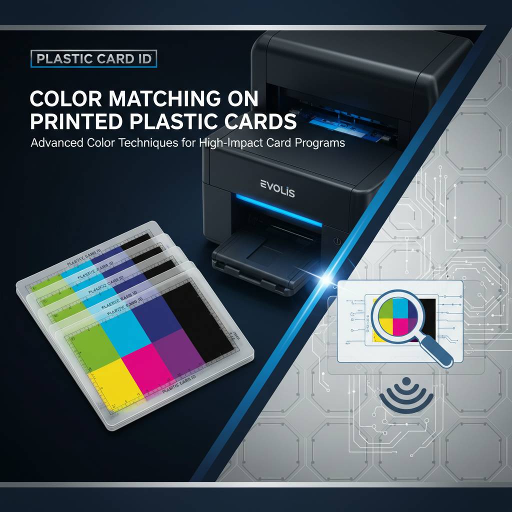 Standard full-color printing covers the vast majority of card programs. But certain applications - luxury membership, VIP access, casino player cards, hotel key cards - call for something that goes beyond the standard CMYK palette. Advanced finishing and encoding options create cards that are visually arresting and technically functional at the same time.
These techniques are not merely aesthetic flourishes. A holographic overlay protects both the card's visual integrity and its encoded data. A metallic accent on a loyalty card communicates premium positioning at every wallet interaction. Selecting the right advanced technique requires understanding both the visual goal and the functional requirements of the card program.
Metallic and Specialty Ink Effects
Metallic color effects on plastic cards - whether achieved through foil lamination, metallic ribbon panels, or specialty inks - occupy a visual space that standard CMYK printing cannot reach. Gold, silver, and metallic accent printing on plastic cards dramatically increases perceived card value, which directly correlates with retention rates in loyalty and gift card programs.
For organizations that want to go further, luxury metal cards in stainless steel, brass, and gold offer a physical weight and tactile experience entirely separate from PVC. Color application on metal cards uses different processes - laser engraving combined with color fill, or screen printing over coated metal - and requires design adjustments to account for reflectivity and surface texture.
Overlay Laminates and Their Effect on Color
Protective overlay laminates seal the printed surface of a card, extending its lifespan and providing resistance to abrasion, UV exposure, and chemical contamination. They also alter the way color is perceived. A gloss overlay intensifies color saturation and deepens contrast, making images appear richer. A matte overlay softens colors slightly and reduces glare, which some brands find more aligned with their aesthetic.
Holograms and custom-pattern overlays add both visual complexity and security. They interact with printed colors in unpredictable ways if not accounted for in the design stage. Always confirm how your chosen overlay will interact with your color design before approving production quantities. A sample proof is worth every penny at this stage.
RFID and Smart Chip Cards: Does Color Printing Change?
RFID proximity cards, contactless smart cards including MIFARE DESFire technology, and smart chip cards add functional layers beneath the card surface but do not fundamentally change the color printing process on the card face. The antenna and chip components are embedded within the card body, invisible to the print process happening on the surface. Color matching considerations remain the same as with standard PVC.
One practical note: some RFID card constructions use a slightly different PVC composite that can affect dye-sublimation absorption very marginally. Testing a sample from each card lot before a large production run is good practice - particularly if your access control or hotel key card program has strict brand standards. CPE supplies RFID and smart chip cards in white and colored options to suit your program needs.
Buyer's Guide: Getting Color Matching Right Before You Order
Informed buyers get better results. The checklist below is not theoretical - it reflects the most common points of breakdown that occur between card design and card production, and addresses each one directly. Running through these items before placing any card order will save you time, money, and frustration.
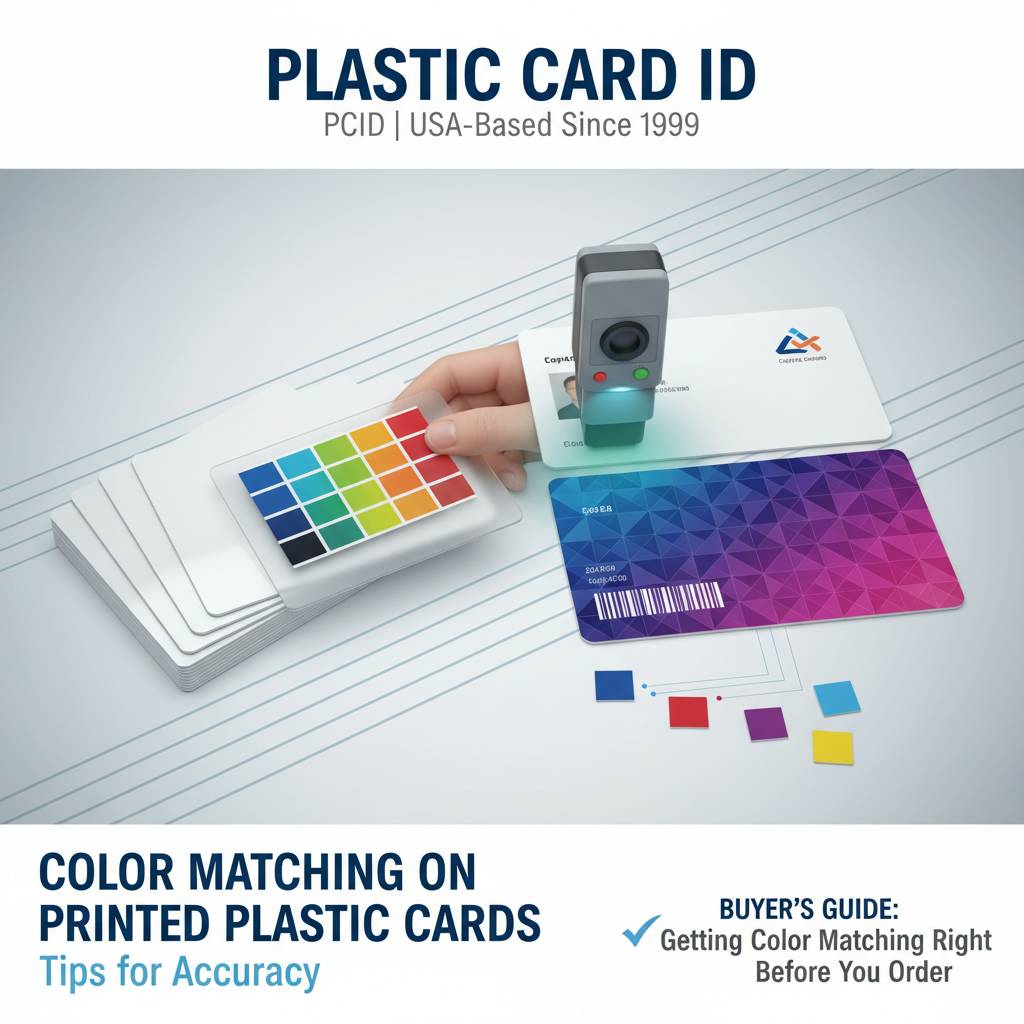
- Convert all files to CMYK before submitting artwork. Do not assume the print provider will handle RGB-to-CMYK conversion in a way that matches your intent.
- Provide Pantone reference values alongside CMYK values wherever your brand guidelines specify them, especially for logo colors.
- Request a physical proof for any order over a few hundred cards. A digital proof is useful; a physical card is definitive.
- Specify your substrate - white PVC, frosted, clear, or colored stock - and confirm your color expectations are realistic for that surface.
- Match ribbon type to card stock for in-house printing. Confirm compatibility with your printer model before ordering large ribbon quantities.
- Use known-good reference cards from a previous approved run as a quality benchmark when starting a new batch.
- Clean your print head before any color-critical production run, regardless of when the last cleaning occurred.
- Document your printer settings - color density, brightness, contrast - as a named profile once you achieve your target output.
Frequently Asked Questions About Card Color Matching
Why do my printed cards look different from my screen design? Screen displays use RGB light and show a broader color gamut than physical printing. Converting your design file to CMYK before printing and calibrating your card printer will significantly reduce this gap. For the most critical colors, request a physical proof before approving a full run.
Can I match a specific Pantone color exactly on a desktop card printer? Exact Pantone matching is achievable through pre-printed custom card production using offset or high-end digital presses. On desktop dye-sublimation printers, you can approximate Pantone values through careful CMYK conversion and printer calibration, but absolute Pantone fidelity requires a pre-print production process. Ask CPE which production path fits your volume and color requirements.
How Volume Affects Your Color Matching Strategy
At low volumes - say, 50-200 cards per month - in-house desktop printing with a calibrated Evolis, Zebra, or Fargo card printer gives you the flexibility to adjust color settings iteratively and print on demand. Color control is in your hands, literally. The tradeoff is that achieving absolute brand color precision requires ongoing attention to calibration and ribbon quality.
At higher volumes, the economics and quality case for pre-printed custom cards strengthens considerably. Pre-printed cards at scale offer the most consistent and cost-effective path to accurate color reproduction because the printing process is optimized once and then replicated identically across thousands of units. CPE can help you determine the breakeven point for your specific program.
Why Plastic Card ID Is the Right Partner for Your Card Color Program
 Over 25 years. More than 100,000 customers. More than 50 million cards delivered to businesses across the United States. These numbers represent something more important than scale - they represent institutional knowledge built through every card program type imaginable, from small nonprofit membership cards to large-scale retail gift card rollouts. Plastic Card ID has seen what works, what fails, and what separates a card program that performs from one that frustrates.
Color matching is one of the details that separates a professional card program from an amateur one. Getting it right builds brand trust at every single card interaction. Getting it wrong erodes it - subtly, consistently, at scale. The good news is that with the right knowledge, the right substrates, and the right production process, consistent color fidelity on plastic cards is entirely achievable for organizations of any size.
A Full Catalog Built Around Your Needs
CPE stocks blank white CR80 PVC cards, magnetic stripe cards in HiCo and LoCo configurations, RFID and proximity access cards, smart chip cards, clear and frosted PVC, and colored stock options. The card printer lineup from Evolis, Zebra, and Fargo covers everything from single-sided desktop units to dual-sided high-volume systems. Ribbons, cleaning kits, card carriers, sleeves, and mailing services complete the one-stop-shop model.
Whether your card program runs 50 cards a month or tens of thousands, CPE scales with you - offering guidance on which products and production approaches align with your specific volume, budget, and quality targets. This is not a transactional supplier relationship - it is a strategic partnership built to help your card program succeed long-term.
Talk to a Card Program Specialist Today
Color questions are best resolved in conversation, not guesswork. If you are unsure which substrate, ribbon, or production process will hit your brand's color targets - or if you want to compare in-house printing against pre-printed custom options - the specialists at CPE can walk you through the decision in a single conversation.
Call 800.835.7919 to speak with a card program specialist who understands color matching challenges from both a technical and a practical standpoint. No pressure, no jargon - just straightforward guidance built on decades of card program experience.
Ready to get your colors right and your card program running at its best? Contact Plastic Card ID today at 800.835.7919 - and let a team with over 25 years of plastic card expertise help you build something that represents your brand exactly the way it should.